The Power of Swiss Design in Modern Dashboard Interfaces
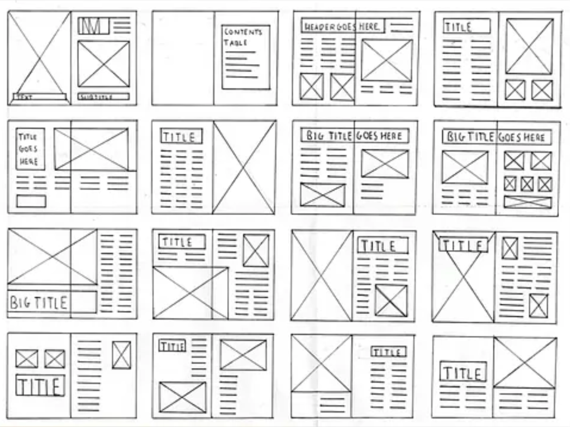
In an era of cluttered interfaces and overwhelming digital noise, we believe in the clarity of the Swiss Design movement. By prioritizing clear typography, logical grid systems, and functional aesthetics, we have fundamentally transformed how our users interact with data across the Polaris and DevStudio ecosystems.
The Philosophy: Form Follows Function
Our design system is built on the core belief that design should never be a distraction. We aren't just designing screens; we are engineering tools that allow information to speak for itself. By stripping away non-essential styling, we ensure that every interaction feels intentional.
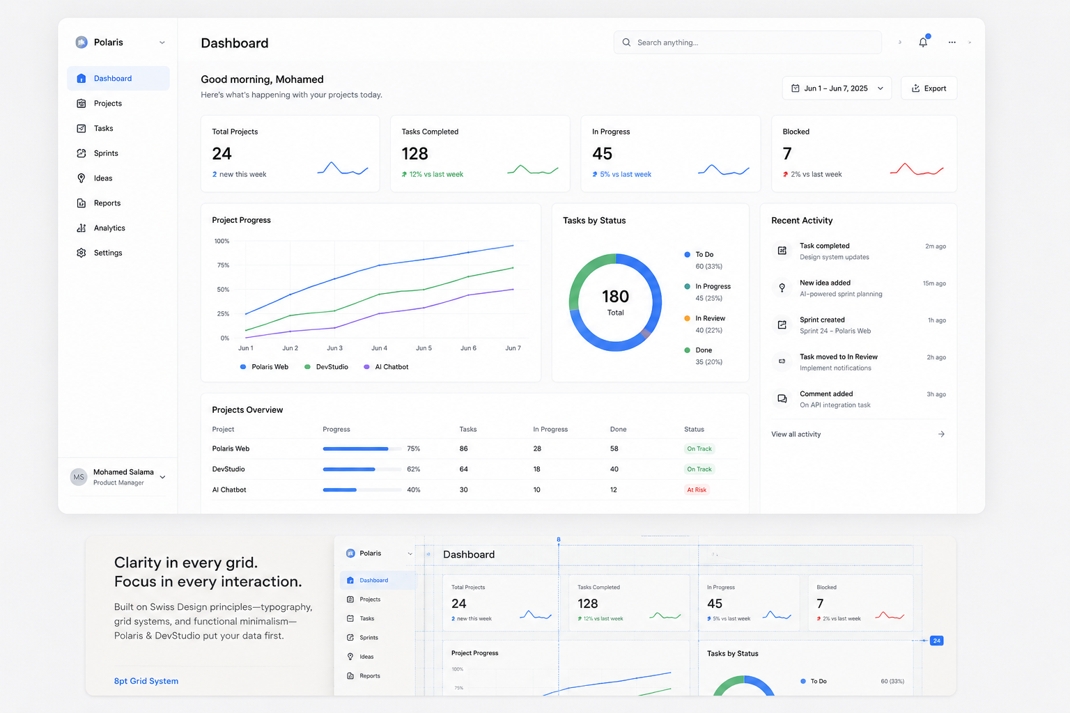
The 8-Point Grid System: Our North Star
By utilizing a strict 8-point grid, we ensure that every UI element—from the smallest icon to the largest data widget—has its perfect, calculated place. This approach provides several key benefits:
- Visual Consistency: Predictable spacing and alignment across all dashboard modules.
- Reduced Cognitive Load: When the design becomes predictable, the user spends significantly less time "learning" the UI and more time analyzing their critical data.
- Scalability: New features can be integrated into our monorepo architecture seamlessly without breaking the visual hierarchy.
Conclusion: When Design Fades Away
Ultimately, this isn't just about "looking clean" or following trends. It’s about empowerment. When the interface fades into the background, the data becomes the absolute focus. We believe that the best design is the one that gets out of your way and lets the user get the job done.